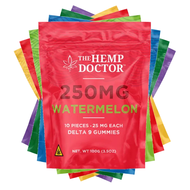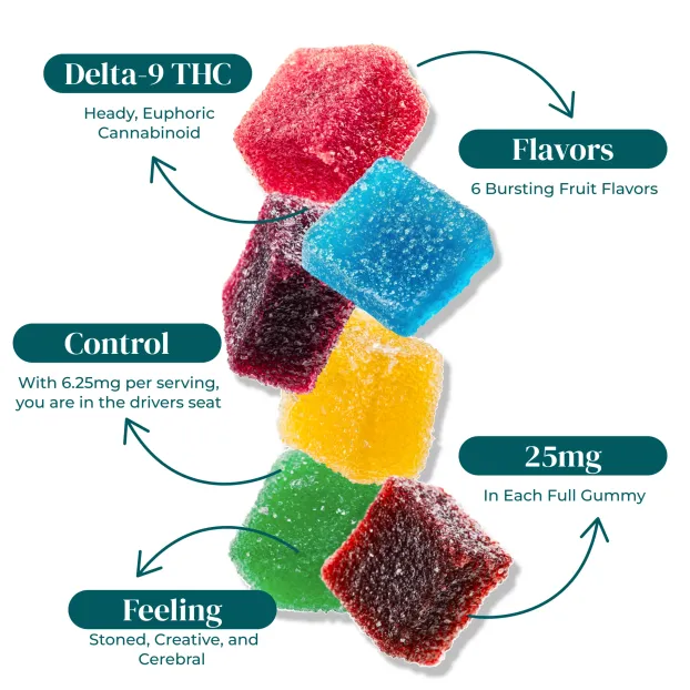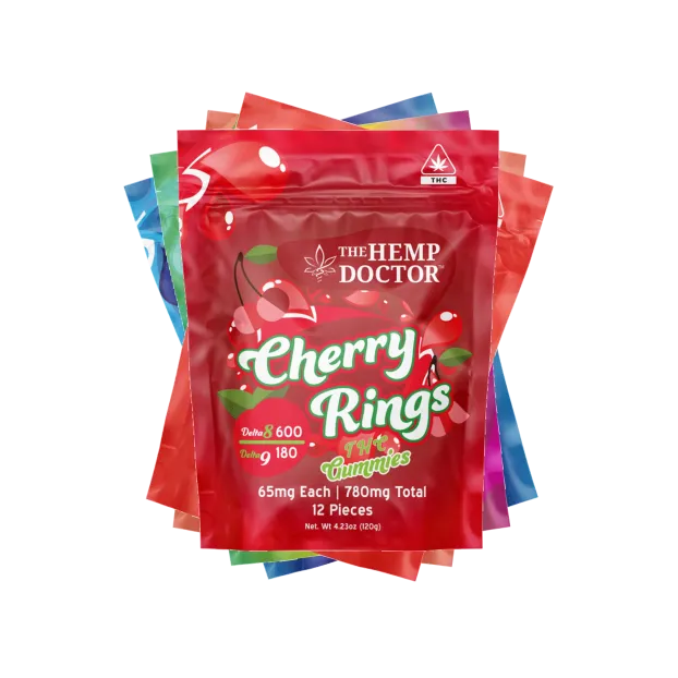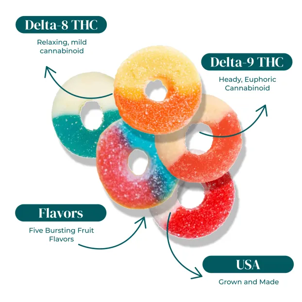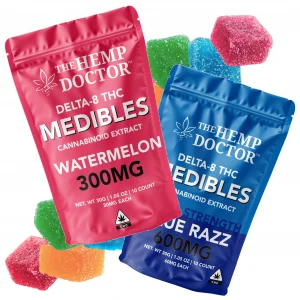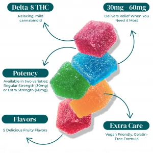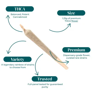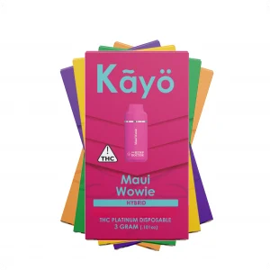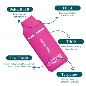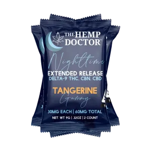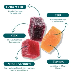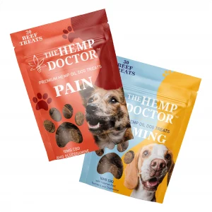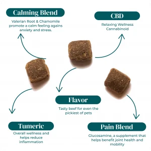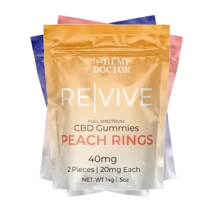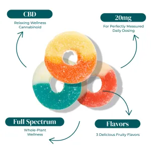

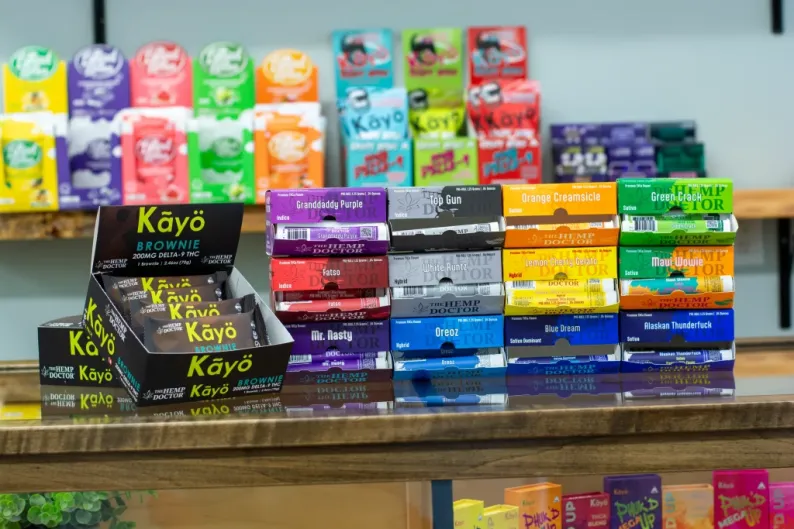
Walk into any dispensary or scroll any hemp storefront, and you’ll see the same thing happen in under two seconds. A shopper’s eyes land on a shelf, scan a grid, and pick a winner before a budtender opens their mouth or a product description loads. That snap judgment is cannabis branding doing its job, and the packaging is the one making the pitch. Strong design closes sales that staff never even get a chance to start.
Quick Answer: Cannabis branding works because packaging acts as a silent salesperson, communicating quality, trust, and category fit in the half-second before any human conversation happens. Brands that treat packaging as the lead asset, not an afterthought to logo work, often see better shelf pickup, stronger recall, and more organic reach online.
🔑 Key Takeaways
- Cannabis branding is decided at first sight, so packaging design has to close the sale before any conversation happens.
- Treat packaging as your top sales rep, not a finishing touch, and measure it like one.
- Premium materials and finishes can raise perceived quality and help defend higher pricing on branded cannabis products.
- Design for the thumbnail first, because hemp brands compete on the digital shelf as much as the dispensary shelf.
- Build compliance text and child-resistant structure into the layout from day one to avoid ugly retrofits later.
Consumers Shop Visually First
Shoppers do not read shelves. They scan them. In a busy retail floor or a crowded product grid, the brain processes color, shape, and contrast long before it processes text. That means your visual identity, color schemes, and packaging design are doing the heavy lifting of brand introduction, qualification, and persuasion all at once.
The cannabis market is especially brutal on this front. A single dispensary case can hold forty SKUs, and a search results page for flower can return hundreds of options. The shopper is not comparing every detail panel first. They are looking for a fast visual cue that says, “This one is for me.” If your packaging hesitates, the shopper moves on.
Think about how this works in practice. A shopper looking for daytime flower has an internal image of what that product “should” look like. Bright, clean, energetic colors. Clear product callouts. Strain-forward typography. If your packaging matches that mental shortcut, you get picked up. If it fights the shortcut, you get skipped, even if your flower is better than what’s next to you. Visual identity is not decoration. It is a qualification.

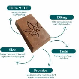

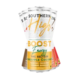
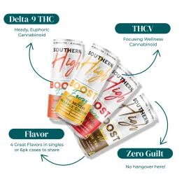
Your Packaging Is a Silent Salesperson
Here’s the part most cannabis branding guides skip entirely. They bury packaging under “visual identity” as if it were one element of many. From inside a working hemp brand, that’s backward. Packaging is the main event. It is the one asset that has to perform at the exact moment of purchase.
Shelf psychology is real, and it is unforgiving. At the point of decision, a shopper is running three checks in parallel: Do I trust this brand? Is this the right category and product type? Does this feel worth the price? Cannabis product packaging answers all three before the customer’s hand moves.
Heavy stock, soft-touch finishes, and tight print registration whisper, “this brand spent money on itself, so the product inside is probably worth it.” Thin film, smudged ink, and crooked labels do the opposite, no matter what the product details say.
We’ve watched specific cannabis packaging design choices move real numbers on our wholesale side. A jar with a matte black finish and a foil-stamped strain name gets picked up more often than the same flower in a clear pop-top, even when both sit on the same shelf at the same price.
Tincture cartons with a clear front window and visible dropper often outperform fully printed boxes because the shopper can verify the product without asking for help.
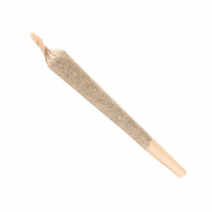
Pre-roll tubes with a tactile, embossed wrap get reordered more often by retail buyers because they generate fewer “what is this?” questions on the floor.
The pattern is consistent. Packaging that answers the shopper’s silent questions converts. Packaging that creates friction, even small friction like “I can’t tell which strain this is from three feet away,” loses the sale to whatever is next to it. That is what we mean by silent salesperson. It is closing or losing deals every minute the store is open, and most brands never measure the loss.
The Four Jobs Your Packaging Does Before Anyone Speaks
If packaging is your silent salesperson, here is its job description. Four things it does before a word is spoken.
1. Premium Packaging Increases Perceived Quality
Materials do more than protect the product. They set the price ceiling. A flower jar with a glass body and a magnetic-close lid can hold the same eighth as a plastic pop-top, but shoppers may be willing to pay more for the glass one. The packaging is the proof of value, and the brain accepts that proof before the shopper ever opens the jar.
Finishes matter the same way.
- Soft-touch lamination signals craft.
- Foil stamping signals investment.
- Spot UV signals attention to detail.
None of these changes the product inside, but all of them can influence what the customer believes about its overall quality. For branded cannabis products competing in a category where product details may look similar on paper, perceived quality is the lever that moves price.
Here is a simple way to think about which finishes earn their cost back at retail.
| Finish or Material | Perceived Signal | Best Use Case |
| Matte soft-touch | Craft, premium, modern | Flower jars, tincture cartons |
| Foil stamp, gold or silver | Investment, luxury | Limited drops, gift sets |
| Spot UV gloss | Detail, polish | Logo highlights on cartons |
| Embossing or debossing | Tactile quality | Pre-roll tubes, edible boxes |
| Clear window | Transparency, verification | Gummies, tinctures, flower |
| Recycled kraft | Natural, earth-forward | Lifestyle and wellness lines, CBD |
2. Bold Branding Improves Product Recall
Recall is where cannabis brand marketing stops being abstract and starts showing up on the P&L. A shopper who can remember your name, your color, or your shape after leaving the store is a shopper who can ask for you by name on the next visit.
Distinctive brand assets, such as a specific blue, a specific silhouette, or a specific typeface, compound over time. Every shelf pickup, every unboxing photo, every dispensary display teaches the market what “you” look like.
After enough repetitions, the asset itself becomes the brand. The shopper sees the color and reaches for the product before reading the name. That is the moment recall starts driving repeat purchase.
Measurable outcomes follow when packaging consistency holds across the line. We track a few signals worth watching if you’re trying to tie cannabis branding to numbers instead of vibes.
| Metric | What It Reveals | How Packaging Affects It |
| Repeat purchase rate | Customer remembered you | Strong distinctive assets, consistent palette |
| Aided brand recall | Top-of-mind awareness | Bold, simple, ownable visual cues |
| Product page conversion | Thumbnail did its job | High-contrast packaging that reads at 200 pixels |
| UGC and unboxing volume | Packaging earned a post | Tactile finishes, surprise inserts, clean reveal |
| Search visibility for brand name | Demand is being created | Recognizable packaging featured in third-party content |
The brands that ignore these numbers tend to redesign every eighteen months chasing a trend. The brands that watch them tend to evolve slowly, protecting the distinctive assets that already work. Bold branding is not loud branding. It is branding that the market can still pick out of a lineup six months from now.
3. Shelf Appeal in Crowded Categories: Physical and Digital
Most cannabis branding advice assumes the customer is standing in a dispensary. For hemp-derived products, that assumption is often wrong. A large share of sales happens direct-to-consumer online, where the “shelf” is a product grid thumbnail, a search engine result, a marketplace listing, or an Instagram tile. The rules of attention are the same, but the format is brutally smaller.
A thumbnail is roughly 200 pixels wide. At that size, fine typography disappears, color blocking dominates, and structural silhouette becomes the entire brand. If your packaging only looks good at full size in a studio photo, it is invisible on the digital shelf.
We’ve seen products with beautiful in-person design quietly underperform online because the thumbnail just reads as a blurry rectangle. Meanwhile, simpler packaging with strong contrast and a recognizable shape jumps off the grid.
The physical shelf rewards similar discipline. Dispensary cases are crowded, lit unevenly, and often viewed from awkward angles through glass. Packaging that depends on subtle gradients or photographic backgrounds gets washed out. Packaging built on flat color, clear hierarchy, and a strong silhouette holds up. If you’re planning how to start a cannabis brand or building an in-house cannabis brand from scratch, this is one of the first places to invest. Get the digital and physical thumbnails right, and the rest of the marketing gets cheaper because the packaging is already doing free conversion work everywhere it appears.
The brands that win in a saturated cannabis market are not the loudest. They are the ones that stay legible at every size, in every lighting condition, in every format the shopper is likely to see them in.
4. Social-Media-Worthy Packaging Drives Curiosity
Shareable cannabis packaging is one of the cheapest acquisition channels in the category, and almost nobody talks about it as a channel. Every unboxing video, every shelfie, every “look what came in the mail today” post is a paid ad you did not pay for. The packaging is the creative.
What makes packaging post-worthy is not a gimmick. It is a small, deliberate moment of surprise. A textured wrap that feels different from what is expected. A printed message under the lid that only the buyer sees. A box that opens in an unusual sequence. A magnetic close that snaps satisfyingly. These details cost very little per unit and earn a wildly disproportionate amount of organic content.
The math is straightforward. If one in fifty customers posts an unboxing because your packaging earned it, you are paying for the lid print once and getting impressions every week for a year. That’s free reach in a category where paid ads are restricted on almost every major platform. For hemp brands locked out of Meta and Google ads, packaging-driven UGC is one of the only scalable channels left.
Design with the camera in mind. Ask whether the unboxing has a clean reveal. Ask whether the product photographs well on a kitchen counter at noon. Ask whether the inside of the box is considered as the outside. Those questions cost nothing to ask, and they change what gets shared.
Staying Compliant Without Going Boring
Compliance is where most cannabis branding articles get vague. They say “follow the rules” and move on, which is useless if you are the one trying to design a label. For hemp-derived products, the rules are specific, and they shape what you can legally print.
Keep Your Claims Honest
For Delta-8, and Delta-9 products sold under the 2018 Farm Bill, federal and state regulators expect honesty and accuracy on labeling and marketing. Avoid language that presents the product as intended for specific health outcomes or as a replacement for professional guidance. Structure-function language can be risky and depends heavily on phrasing. When in doubt, leave wellness claims off the package and let the certificate of analysis speak to the product details.
Cover the Required Label Details
You also need accurate cannabinoid content per serving and per package, total THC reporting where state law requires it, a batch or lot number, a manufacture or expiration date, and a scannable link or QR code to the COA. Many states layer on extra requirements, such as warning symbols, font size minimums, and child-resistant packaging certifications under the Poison Prevention Packaging Act, and those vary widely. State laws differ, and a label that’s compliant in Texas may not pass in Minnesota.
Design In Child-Resistant Packaging
Child-resistant packaging is non-negotiable for Delta 9 edibles and most ingestibles. CR certification is a structural feature, not a sticker, and it has to be designed in from the start. Trying to retrofit a beautiful carton with a CR closure after the fact almost always compromises the look. Build the CR mechanism into the structural brief on day one, and the design stays clean.
Make Compliance Part of the Design
The good news: none of this requires boring packaging. The brands that handle compliance well treat the required text as a design element, give it its own zone, and let the rest of the surface breathe. Compliance is a constraint, and constraints are where good design lives.
Building Cannabis Branding That Sells: Where to Start
If you are launching an in-house cannabis brand or refreshing an existing one, the work is not where most people start it. Skip the mood board, and build in this order:
- Begin with the smallest viewing context your product will appear in: the thumbnail, the dispensary case from six feet away, the phone-screen unboxing. Then design outward from there.
- Lock the silhouette and the palette first. Everything else is decoration on top of those two decisions.
- Pick finishes that match the price tier you want to defend, not the finishes that look fanciest in the design file.
- Build the compliance text into the layout from the first sketch, not the last.
- Pressure-test the design at 200 pixels, in poor lighting, and on a phone camera before signing off on a print run. If the brand still reads as yours under those conditions, you have something that will work.
For wholesale buyers and operators figuring out how to start a cannabis brand without burning a year on revisions, the fastest path is to partner with a manufacturer that already understands these constraints. The Hemp Doctor wholesale program offers retail-ready, branded cannabis products and private-label packaging built to perform on both the physical and digital shelf, with compliance handled in-house.